I’m a Fortune 10 Graphic Designer & Digital Report / Presentation Design specialist in the marketing & communications space, with 9 years of world-class experience, including direct support for 5 SVPs & Directors across global enterprises.
Notable Projects 2025-2021
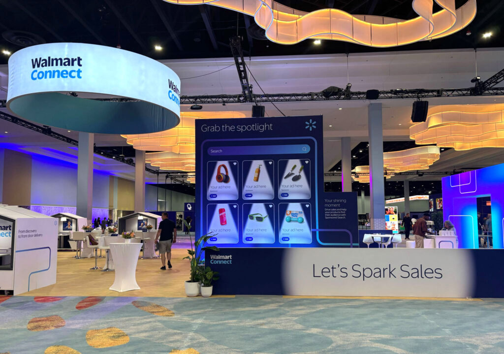
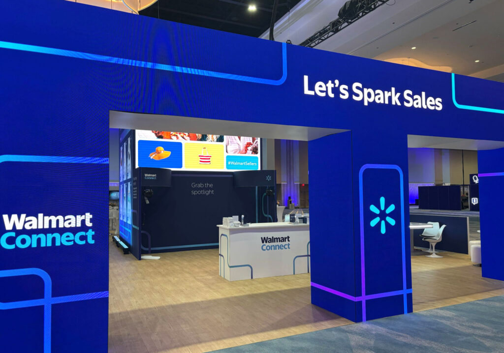
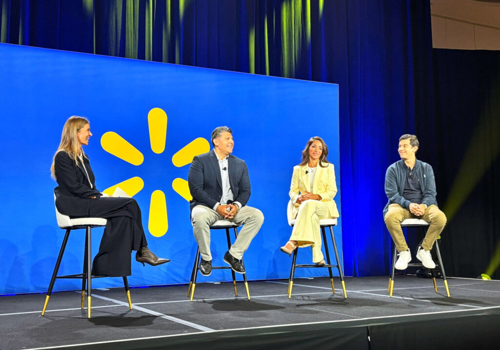
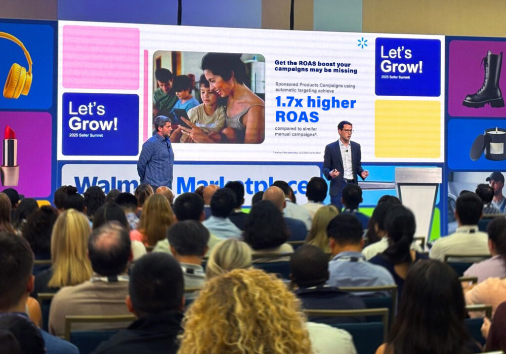
- 2025, Walmart Connect: Primary Designer for Let's Grow 2025 sales conference keynote on new AI ad platform
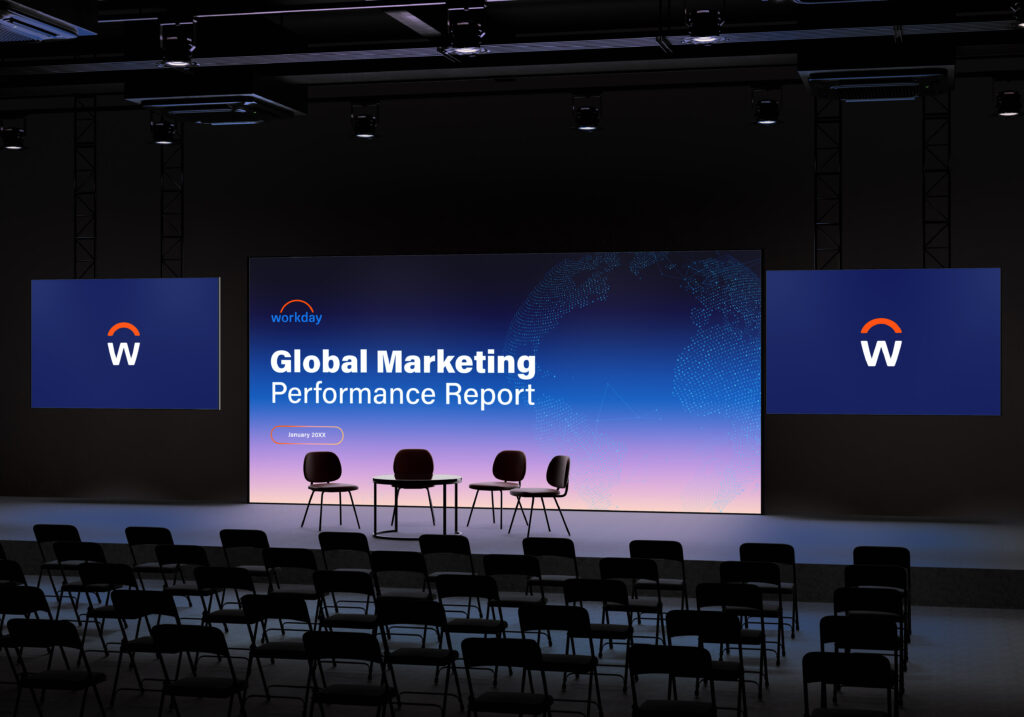
- 2025, Workday: 100% design ownership of bespoke global performance report for VP of Digital Marketing
- 2024, AWS: Content design for 2025 AWS Global Summits across 4 international markets
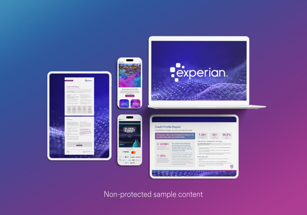
- 2024, Experian: Content design for FDX Global Summit & Vision 2024
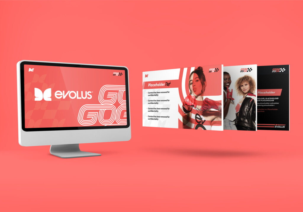
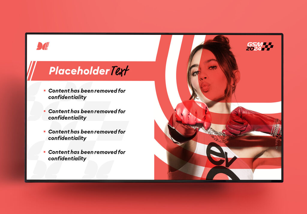
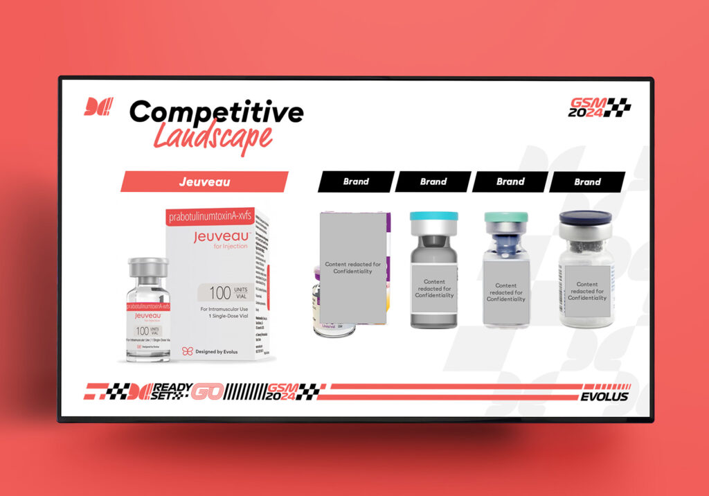
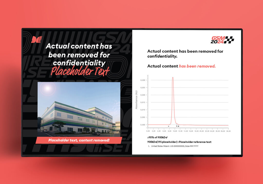
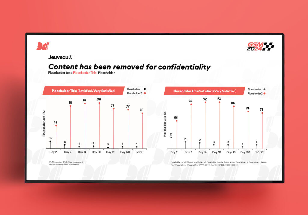
- 2024, Evolus: Content design for GSM2024
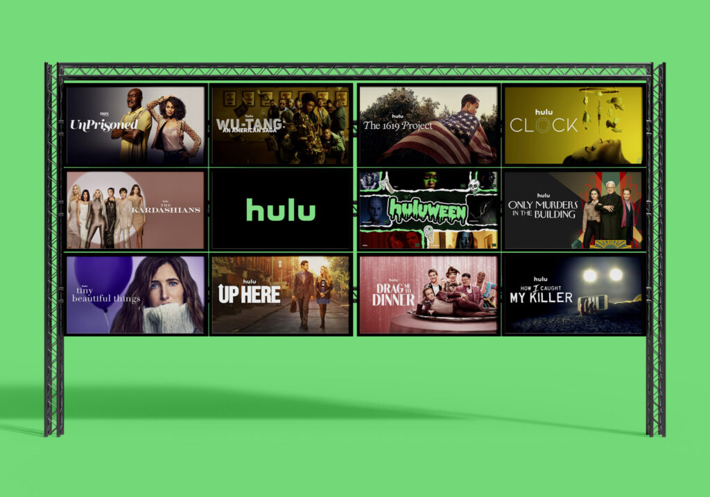
- 2023, Hulu: Executive producer media kits, including The Kardashians and Wu Tang
- 2023, Samsung: Company distributed R&D reports, Director reports, CEO reports
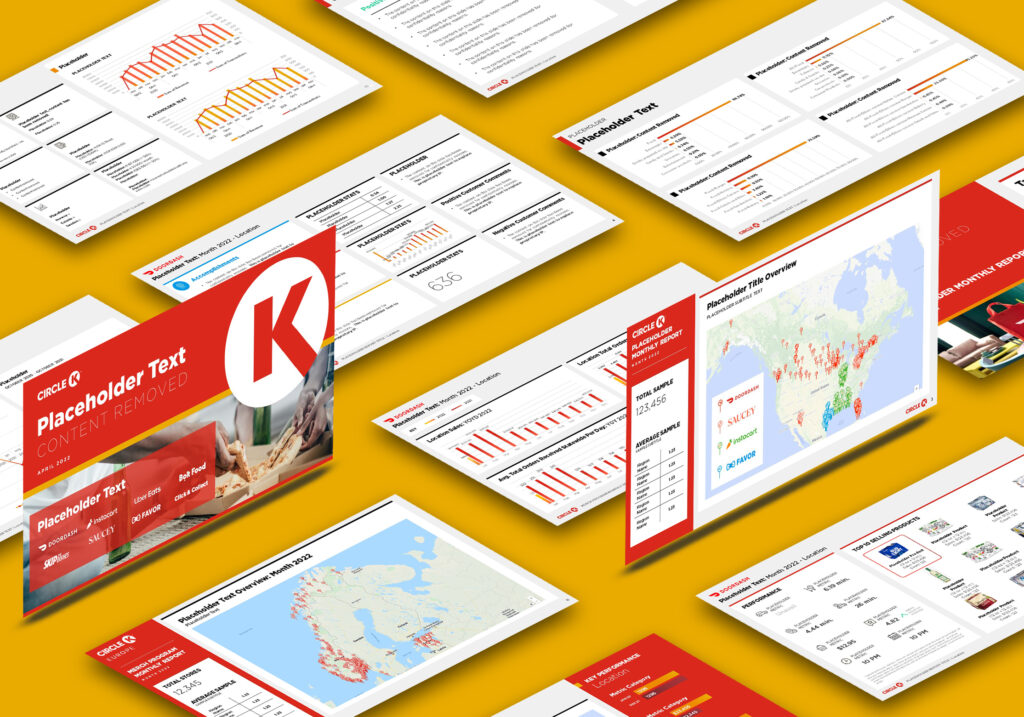
- 2022, Circle K: Global performance dashboard design for e-commerce programs including Doordash and Instacart
- 2021, American Express: New product R&D report
Skill Stack
Hard Skills
Design & Visual Communication
Digital Design
Print Design
Presentation Design
Image Editing
Photography
Illustration
Brand Guides
Icon Design
Layout Design
UI Mockups
Art Direction
Asset Production
Tools & Software
Adobe Illustrator
Adobe Photoshop
Adobe InDesign
CapCut
Powerpoint
Google Slides
Keynote
Figma
Publishing
WordPress
Shopify
Information Design
Content Layout Framing
Narrative Frameworks for Visual Reports
Writing & Microcopy
Soft Skills
Team Skills
Cross-functional Collaboration
Strategic Thinking
Rapid Ideation & Iteration
Stakeholder Alignment
Creative Problem Solving
Project Management
Content Skills
Storytelling for reports and keynotes
Layout compression
Refining “not quite ready” content into launch-worthy assets
Brand guide adherence & extrapolation
AI Toolkit
ChatGPT
Claude
Midjourney
Elevenlabs
CapCut
Luma
Suno
& more
If you have important content that requires thoughtfully crafted on-brand treatment, you’re in the right place.
With a full stack creative background in print, digital, e-commerce, photography, writing, and illustration ranging from high tech to high fashion, I’m an adaptive and resourceful creative addition for any team – small, medium or enterprise.
I look forward to learning how we can work together!
Brand Highlights


Case Study
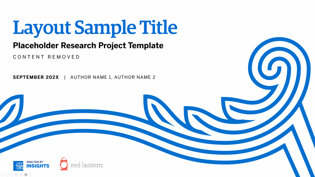
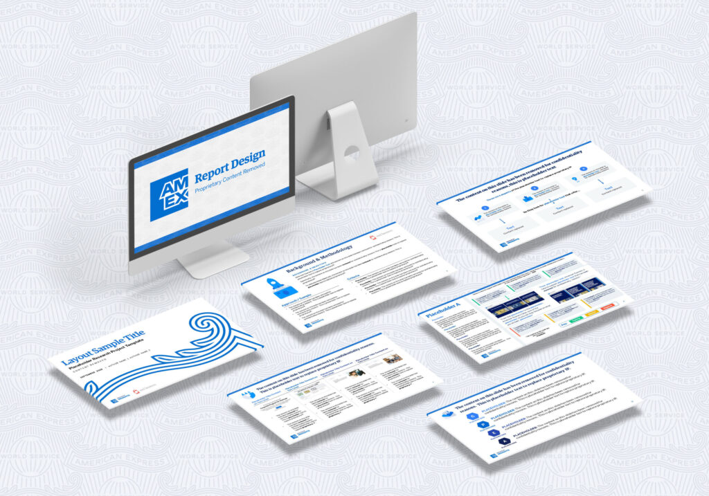
American Express
Qualitative Research Report
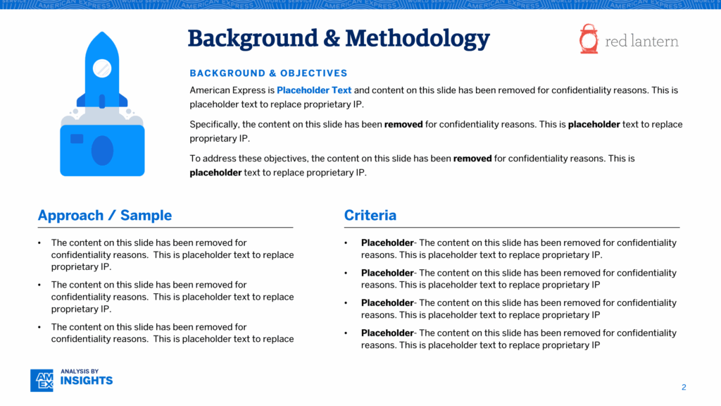
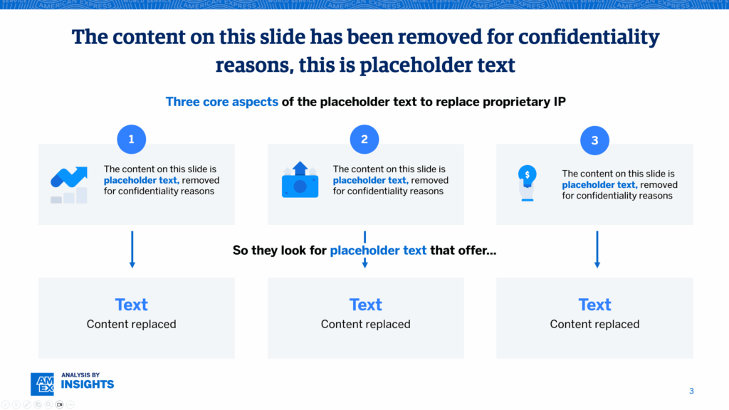
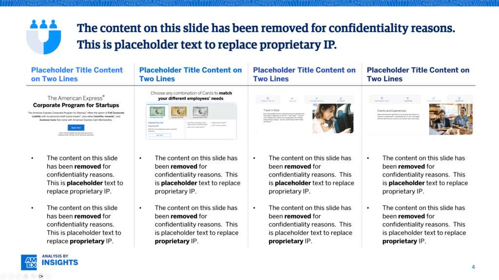
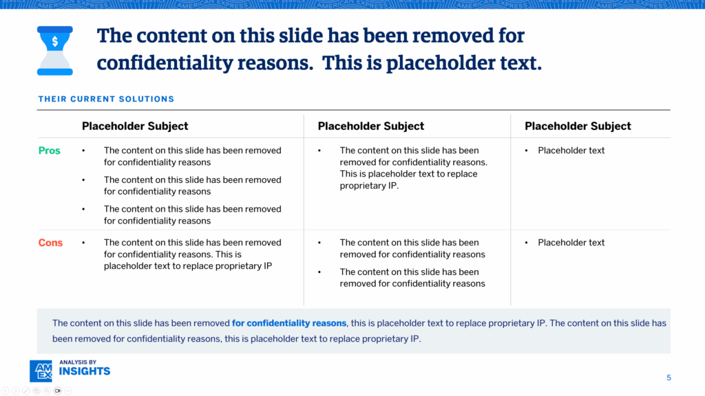
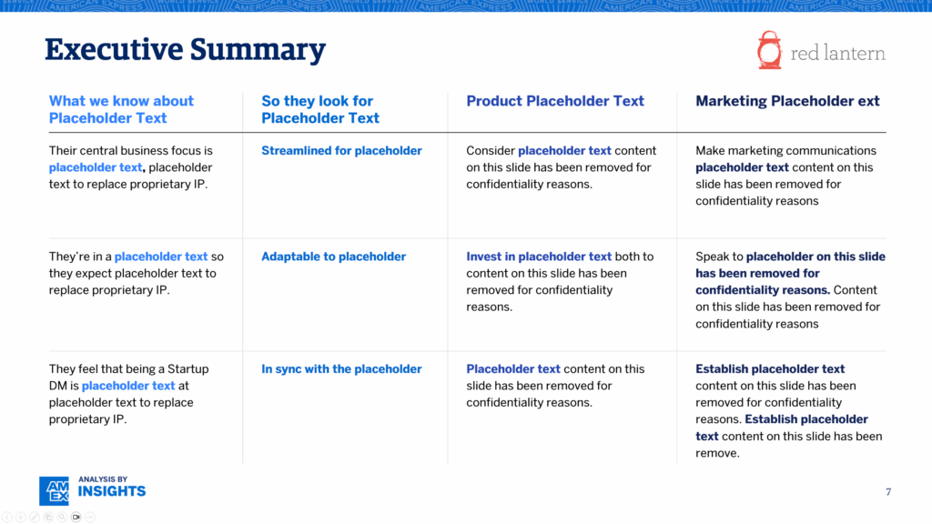
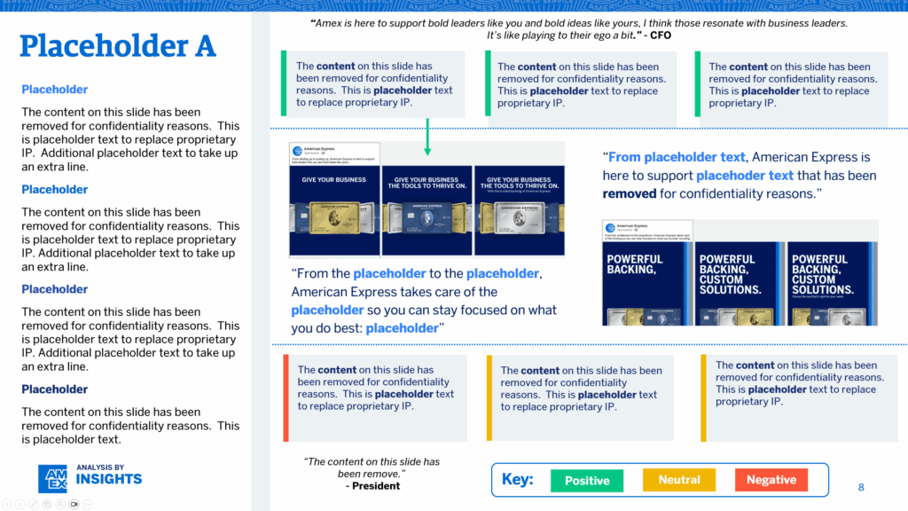
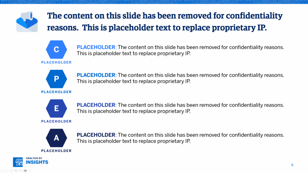
10/52 page sample, IP removed
Project Scope
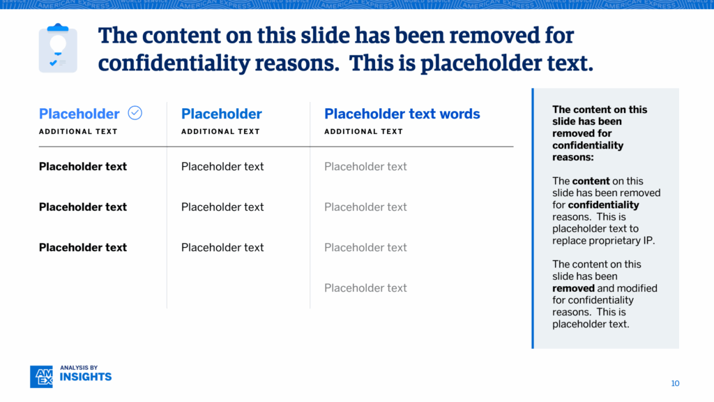
American Express commissioned a deep-dive analysis report of a high-value segment of credit product offerings. The internal research team had collected rich qualitative data—and needed help translating insights into an executive-ready narrative, inside a framework that could guide product, marketing, and sales alignment.
Goal: Synthesize findings into an actionable, high-visibility report to support product development and strategy.
My Role
- Information synthesis & story architecture from research interviews and data sources
- Designing a modular slide system that could scale across content categories and be reused for future initiatives
- Visualizing complex strategic concepts—buyer archetypes, opportunity gaps, product alignment pathways
- Balancing brand guidelines with a flexible, modern approach to storytelling
Process
Decoded Raw Data
Conducted deep reads of anonymized interviews and survey results
Pulled out key drivers: what customers were thinking, feeling, hesitating over, and expecting
Strategic Narrative Development
Collaborated with research leads to define a three-act structure that would resonate with stakeholders
Used insight clustering and prioritization to reduce noise and emphasize high-impact findings
Design & Delivery
Built a robust visual system using AmEx brand standards—emphasizing clarity, hierarchy, and motion where appropriate
Created visual “thought handles” (bold quotes, archetype summaries, decision tree diagrams) to help non-research audiences absorb key insights quickly
Delivered a polished, 30+ slide deck designed for cross-functional adoption
Outcome & Impact
- The final deck was used in executive leadership briefings and across departments in Product, Sales Enablement, and Enterprise Marketing
- Aligned content for a refined go-to-market strategy
- Slide templates were later adopted as the standard format for research comms across the team
- Balancing brand guidelines with a flexible, modern approach to storytelling
- Consulted with brand team at Klarna a couple years later, where I met an executive who had seen my work at a previous role at Amex
Case Study
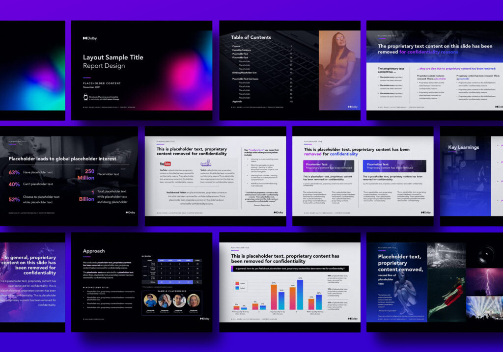
Dolby
Qualitative Research Report
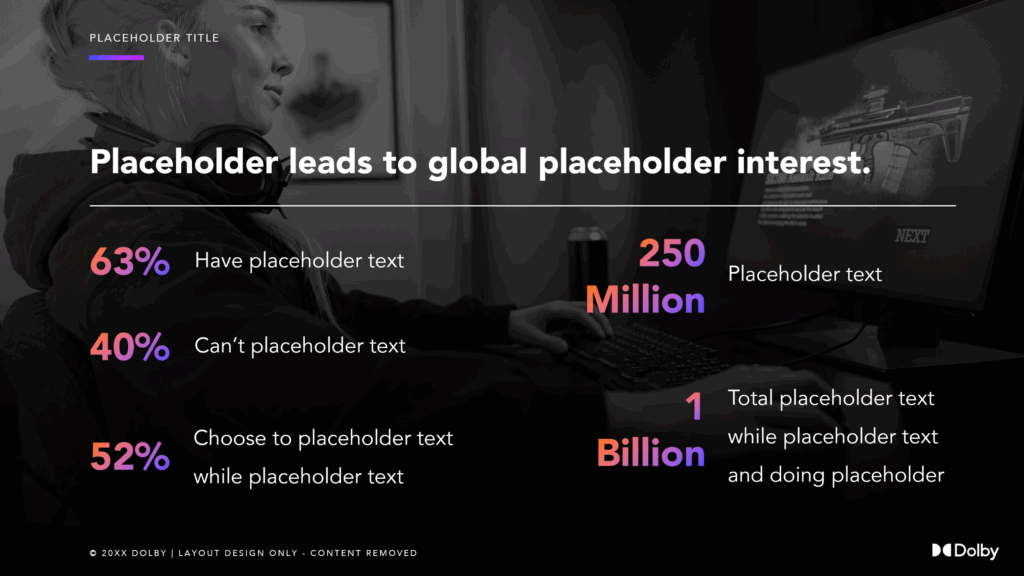
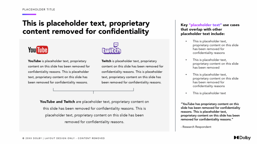
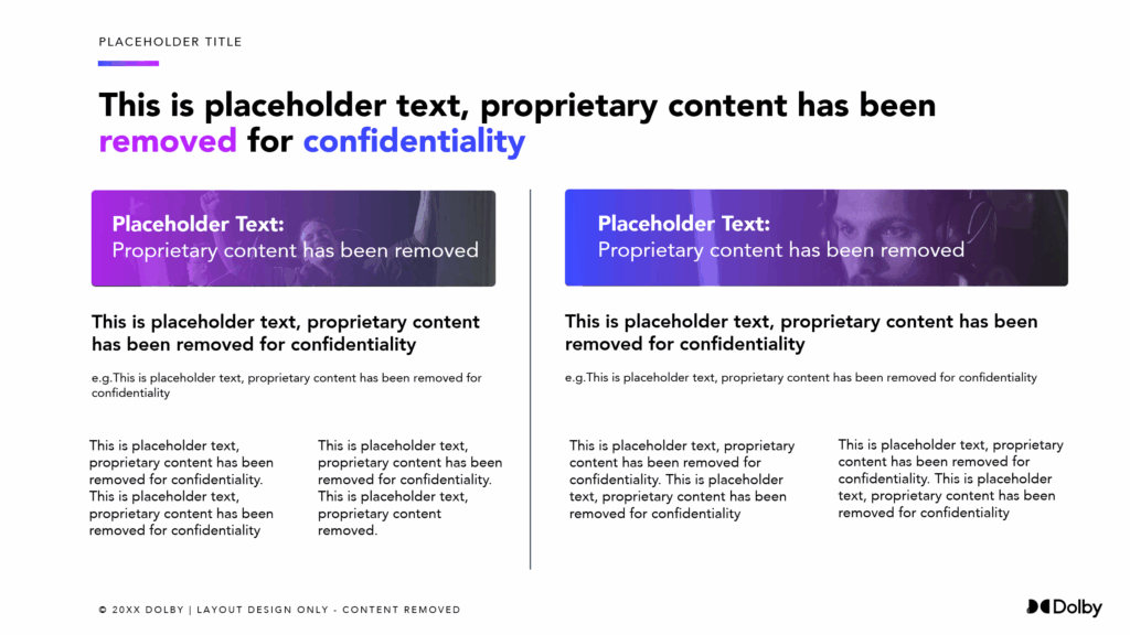
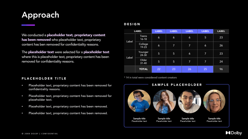
13/196 page sample, IP removed
Project Scope
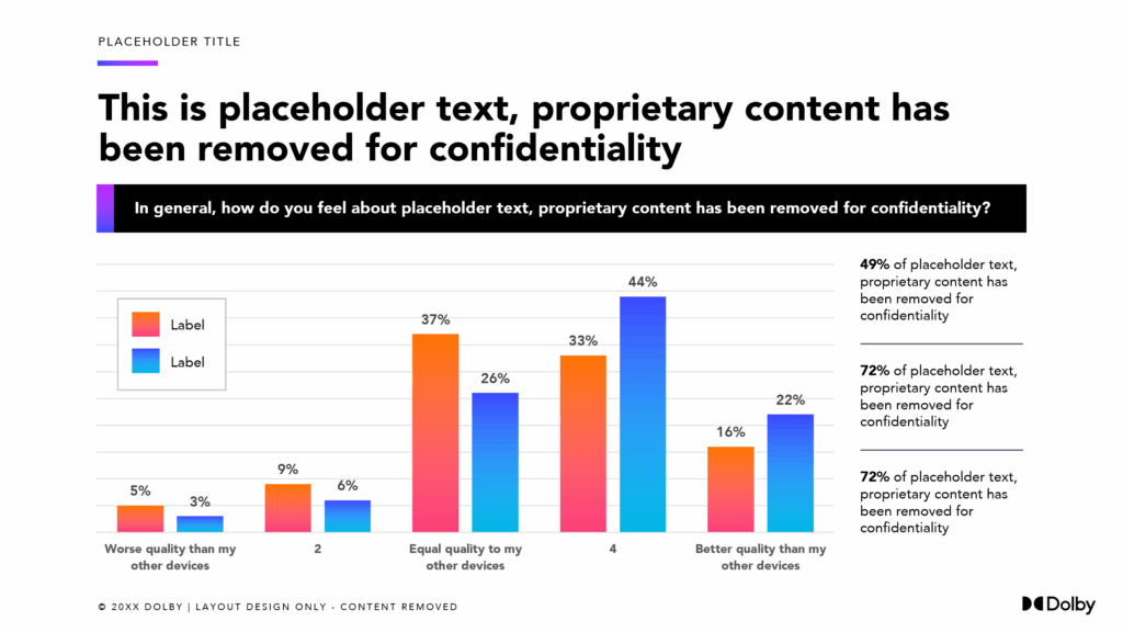
Dolby sought to explore emerging behaviors around audio-visual experiences on personal computers, with a focus on younger consumers. While a comprehensive qualitative research study had already been conducted, the insights needed to be transformed into a narrative suitable for executive leadership.
Goal: Visualize behavioral trend data and to identify where Dolby’s technology could create relevance and value.
My Role
- Designed visually-driven research deck that translated in-depth ethnographic insights into clear opportunity areas
- Created persona-based storytelling frameworks for different demographic categories
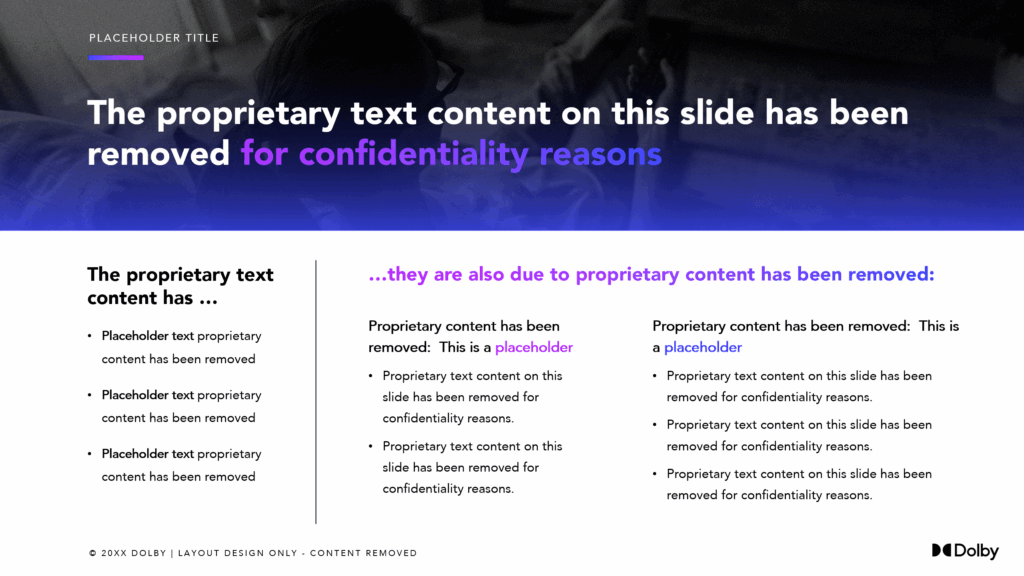
- Constructed a modular, brand-compliant design system that enabled reuse across internal strategy, product planning, and OEM partnerships
Process
Synthesis & Segmentation
Interpreted qualitative data from research study participants
Defined storyline structure for different use cases
Strategic Storytelling
Structured a presentation that clearly separated “intentional” versus “background” device use moments
Visualized generational shifts in how PCs are prioritized over mobile, especially for high-attention tasks
Design Execution
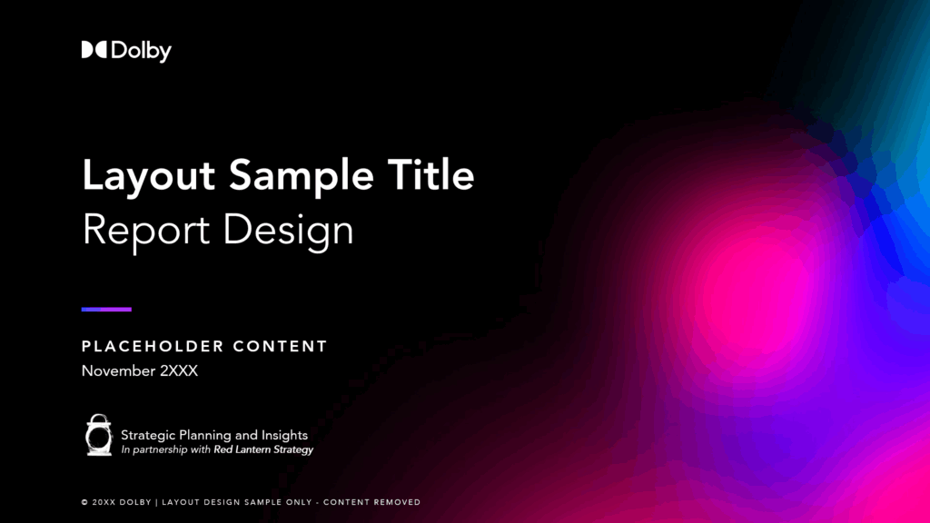
Developed clean, minimal templates using Dolby’s brand standards to support storytelling without distraction
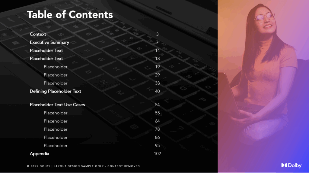
Created modular page layouts for high volume content
Outcome & Impact
- Final deliverable was used in executive briefings and presented to Dolby’s partner teams
- Key insights from the deck informed strategic planning around product positioning, engagement, and partnerships
- Positive feedback of providing an actionable view of consumer behavior across complex ecosystems
Selected Project Snapshots
Walmart Connect Conference Content
E-Commerce Platform
info
Primary content designer for Walmart’s subsidiary Walmart Connect’s e-commerce digital marketing platform, sales conference event Let’s Grow 2025! Designed an animated, video-forward keynote deck (slide 4) detailing a new AI-powered go-to-market ad platform, and sales platform best practices. Designed social media, case study, and blog content for event and core brand.
Workday Digital Performance Report
HR & Business SaaS
info
I had the privilege of joining Workday’s Global Digital Marketing Team to create an executive reporting dashboard depicting several years of in-depth performance metrics. This project was executed in Google Slides, which required painstaking manual placement of thousands of individual data points. I received great feedback on this project from several stakeholders and collaborators and am proud to have supported its success.
Experian Comms Content
Credit Bureau / SaaS
info
Test design samples created for Experian prior to onboarding into CIS (Consumer Information Services) for Q1-2 2024 contract to assist with preparing content for industry events including FDX Global Summit and Vision 2024.
Completed mandatory government-mandated training on consumer data regulations.Hulu Media Kits
Streaming Service
info
While contracting on the Greenhouse team at Hulu , I was tasked with creating branded media kits for upcoming show releases. Formatting key art layouts, creating information layouts, creating mockups for ad placements, and creating animations for trailer spots.
Circle K Reporting Dashboard
Convenience Store Chain
info
An interdepartmental performance report design template series, created for my client Circle K, a global convenience store and petroleum filling station chain. Working directly with one of the global e-commerce department managers, my objective for this project was to create a uniform reporting framework for various geographical teams to provide performance metrics for their individual sections.
A notable feature of this project is a semi-automated branded map pin visualization technique I developed while I was working with one of Digital Realty’s strategy SVPs in 2016. This method is executed via inputting addresses into a mapping software via spreadsheet, and customizing location fields to their corresponding brands.
For this project, I created custom color-coded brand pins to designate locations for regional delivery partners such as Doordash, Instacart, Favor, etc.
Dolby Research Report
Audio tech developer
info
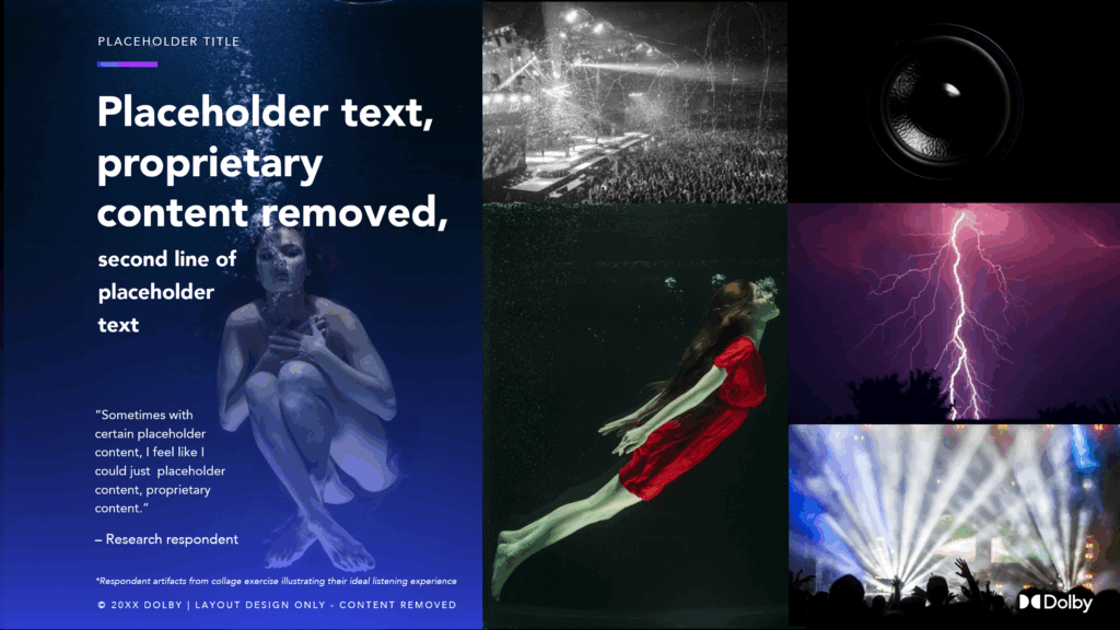
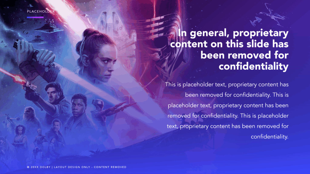
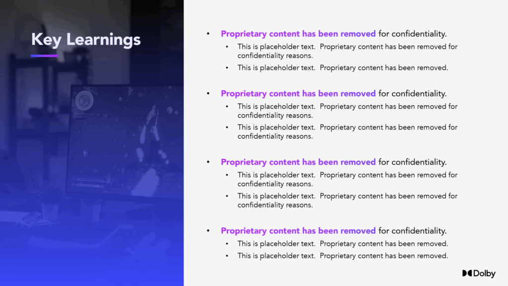
A 100+ page qualitative research report design, prepared for my client’s client Dolby, a global leader in industry standard audio and video technology. A massive flagship research undertaking with the need for several dozen unique page layouts, my approach towards visual continuity and maintaining audience interest was to create an engaging page flow anchored by alternating high contrast core brand colors.
Amex Product Report
Payment Card Provider
info
A 38-page qualitative research report design, prepared for my client’s client American Express, a household name and global leader in payment card services. My objective for this report was to interpret and expand upon AmEx’s official brand book, to create a branded strategy deliverable for their products & services.
Keeping in mind the complexity of concepts presented in this report, my main priority was to structure each segment into digestible pieces while keeping in continuity with the core American Express brand identity.
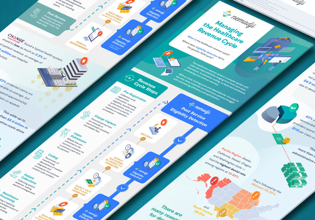
Nemadji Infographic
Medical Billing Service
info
The technical challenge in laying out this infographic was how to show 3 interrelated, highly complex process flows in a narrow vertical format. The client decided on a scroll-down-then-scroll-back-up layout, so that the audience could fully read the Revenue Cycle steps, before going back up to the core service of the Nemadji brand.
Using a very sparse homepage as a brand guide, the main theme followed the logo’s soft teals while a punchy electric blue really highlighted the core service.
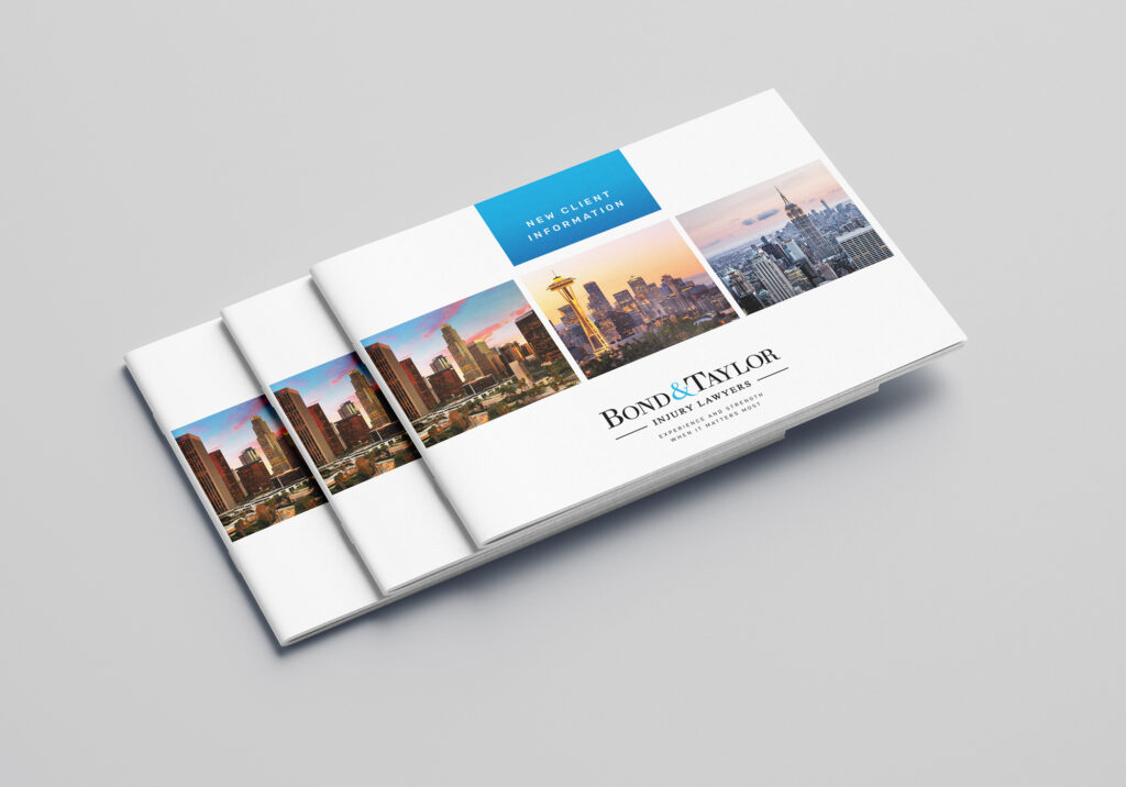
Bond & Taylor Booklet
Law Firm
info
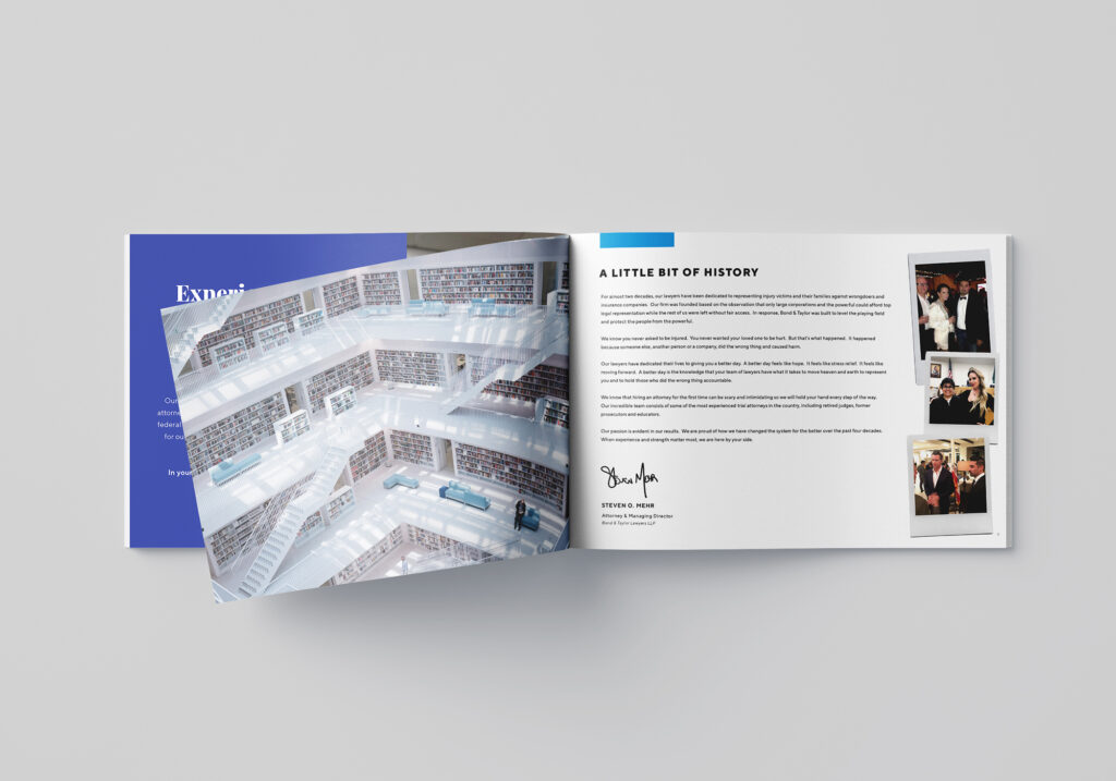
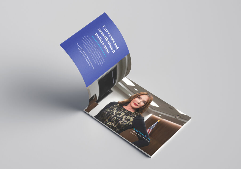
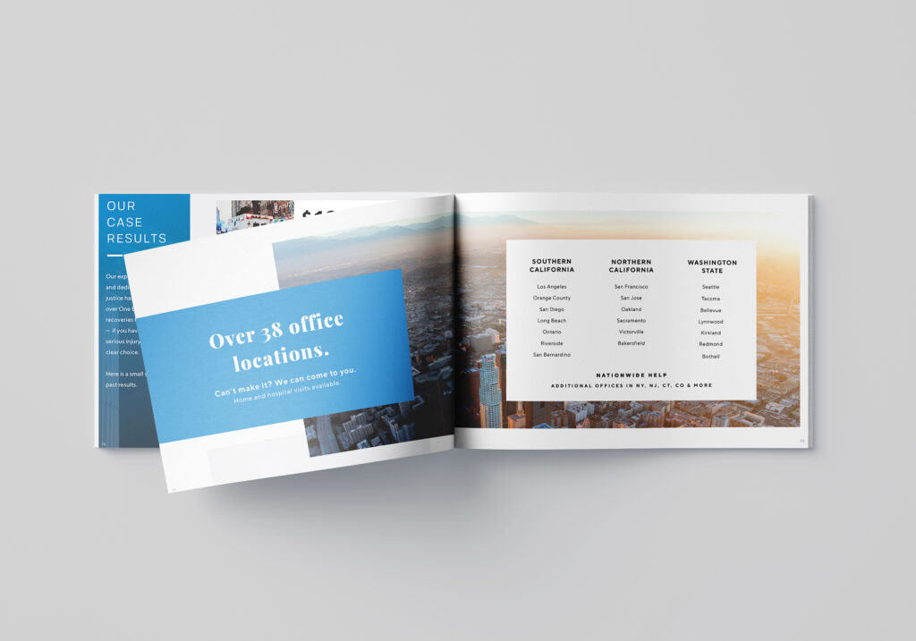
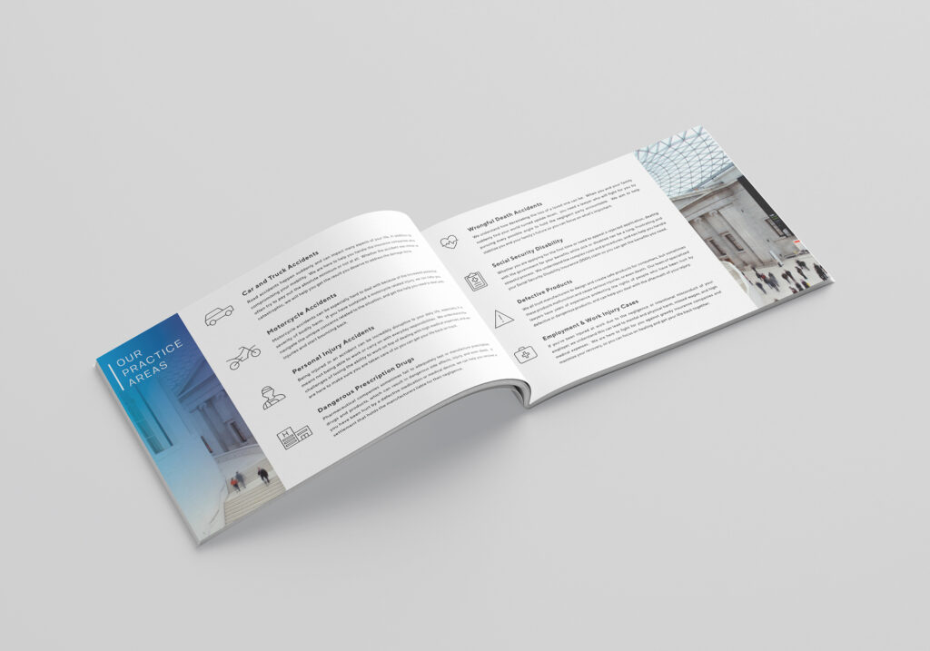
I had the privilege of completely rebranding every single touchpoint for an up-and-coming law firm in Orange County. One of the biggest projects of the year was a 36-page client booklet that would be used in high stakes client signups as well as partnership brokerage. Simultaneously a firm overview as well as personal branding for the directing attorneys and staff, this booklet exemplified the polished white-glove service style of the firm.
Custom.io Web Graphics
Marketing CRM
info
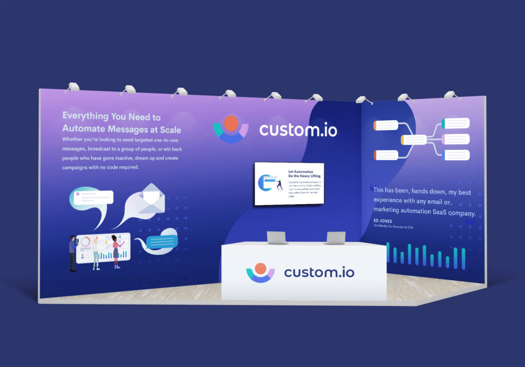
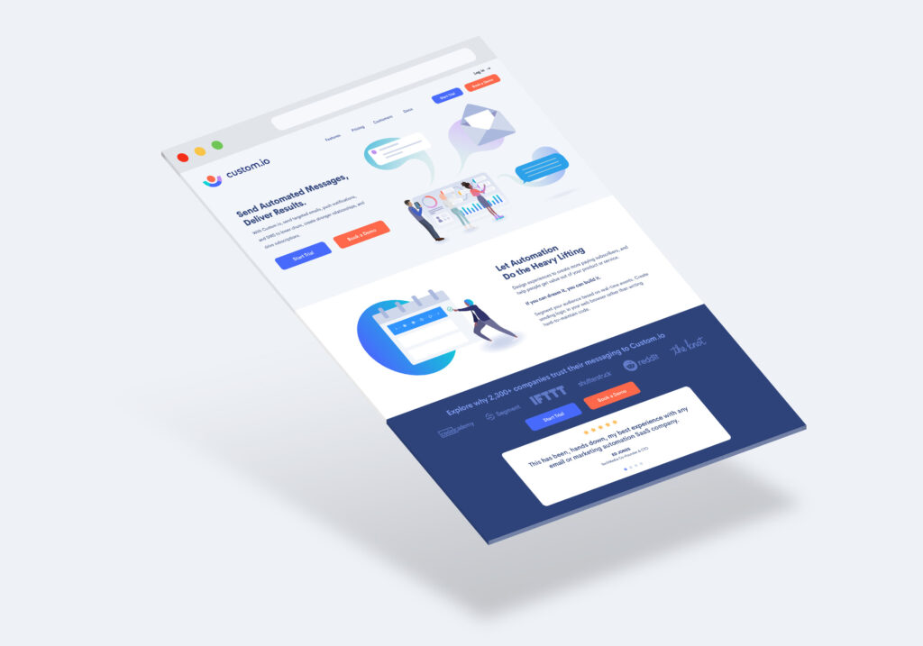
A spec exercise to visually communicate a complex SaaS product in a single image. Starting with a rough digital sketch, the illustration’s focus centers around a lively dashboard experience that shows multiple user phases. The dashboard is surrounded by visual representations of the end product, which are push notifications, email, and SMS. These components spatially dominate the composition in order to emphasize the end goal of reaching multi-channel audiences.
Samsung Store Signage
Electronics Manufacturer
info
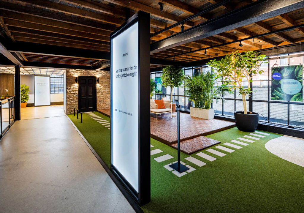
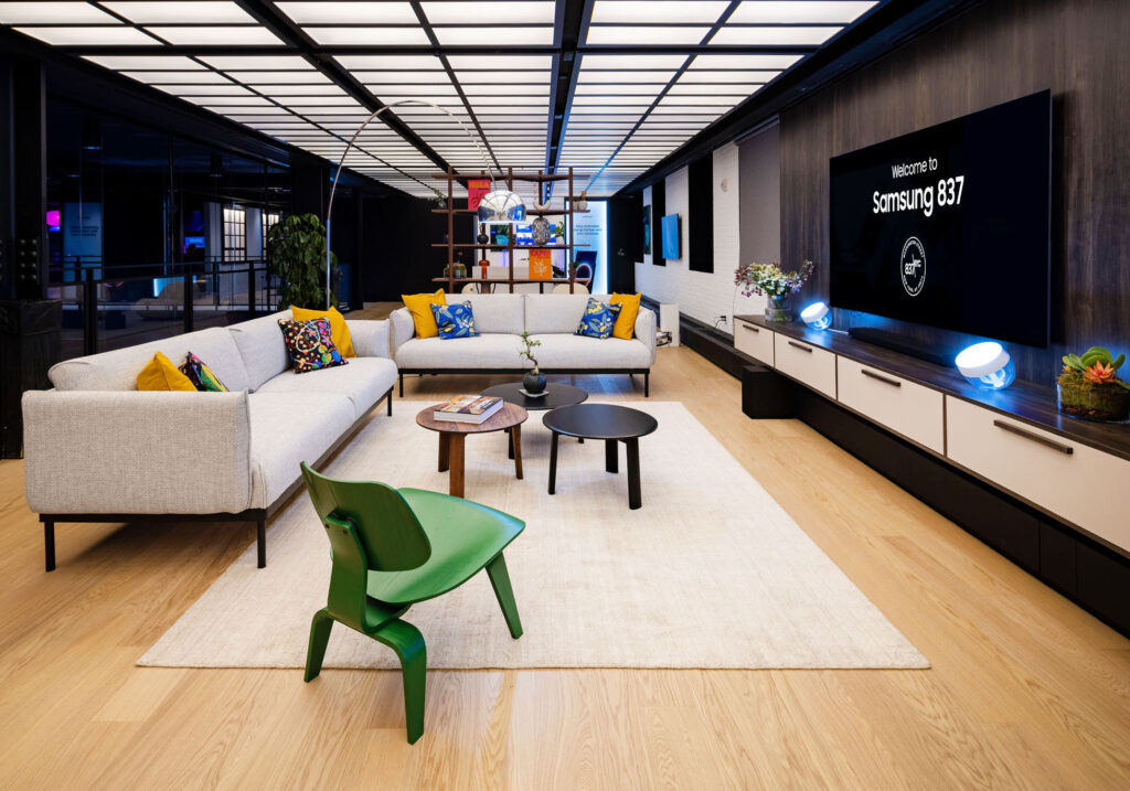
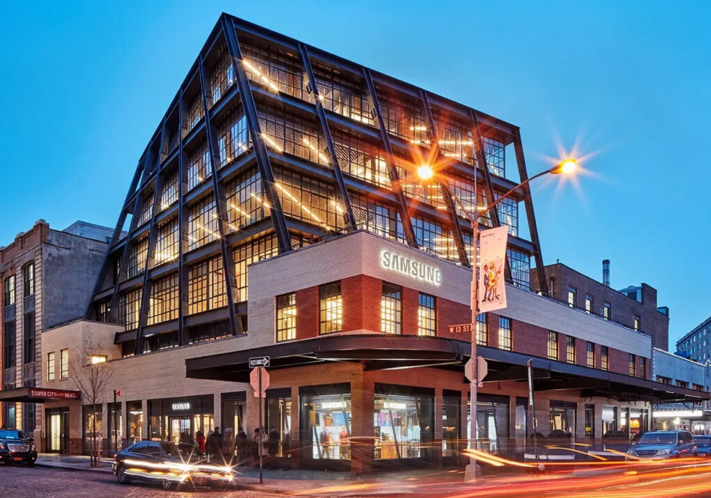
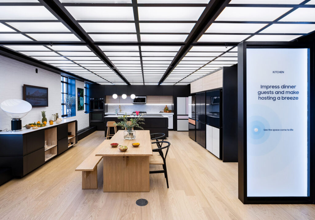
Created while contracting on the Product Innovation Team (PIT) at Samsung Electronics America in Mountain View. I had the opportunity to design signage mockups for Samsung’s 837 flagship store in New York, providing wayfinding instructions for visitors to interact with dynamic lighting and technology functions in product exhibit rooms.
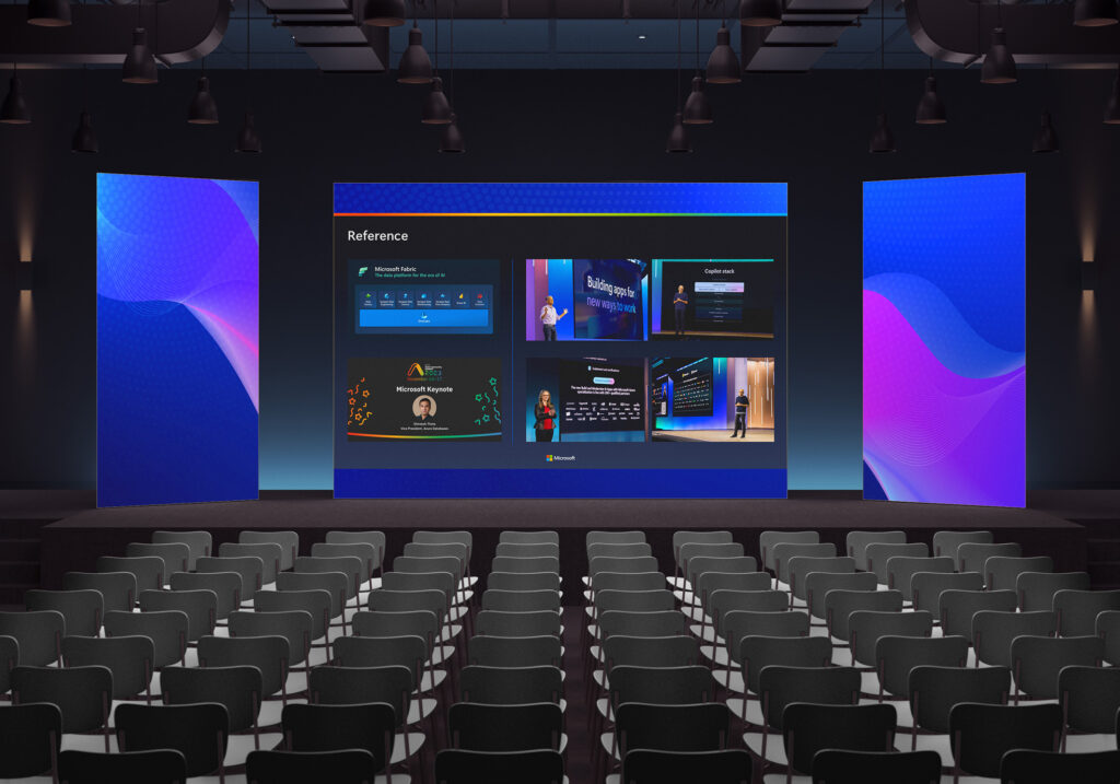
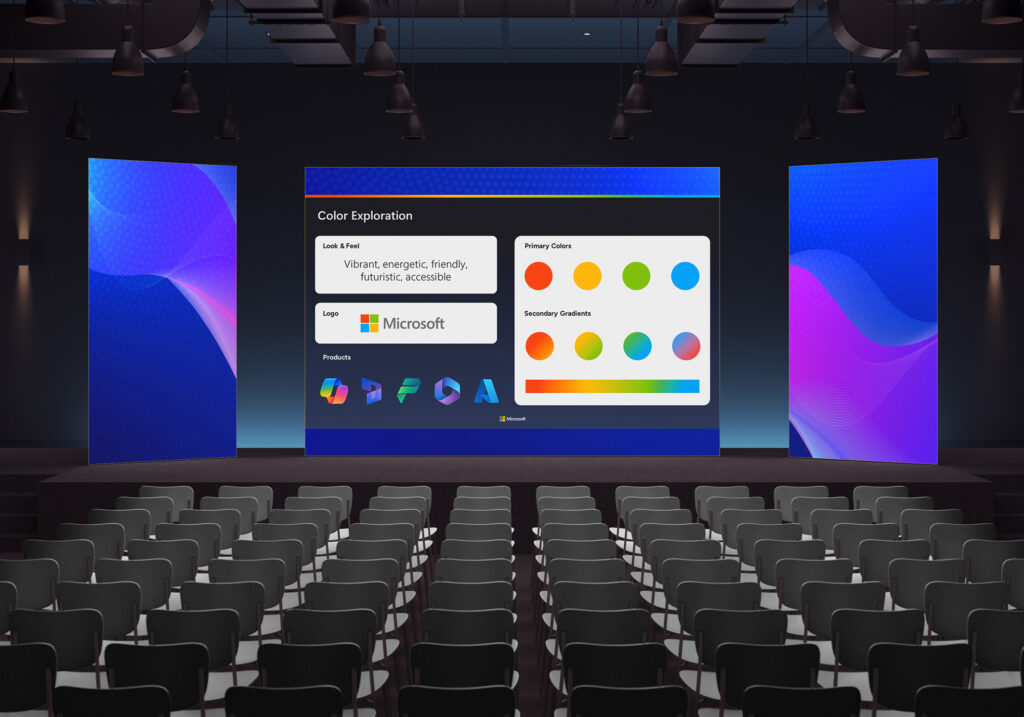
Microsoft Keynote
Computing Tech
info
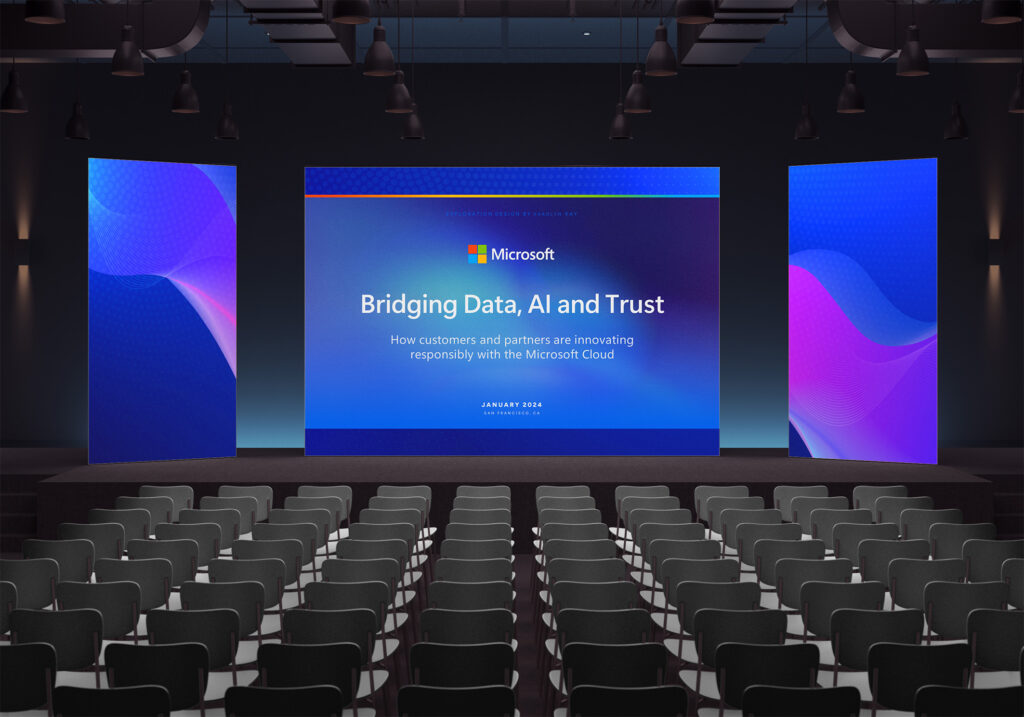
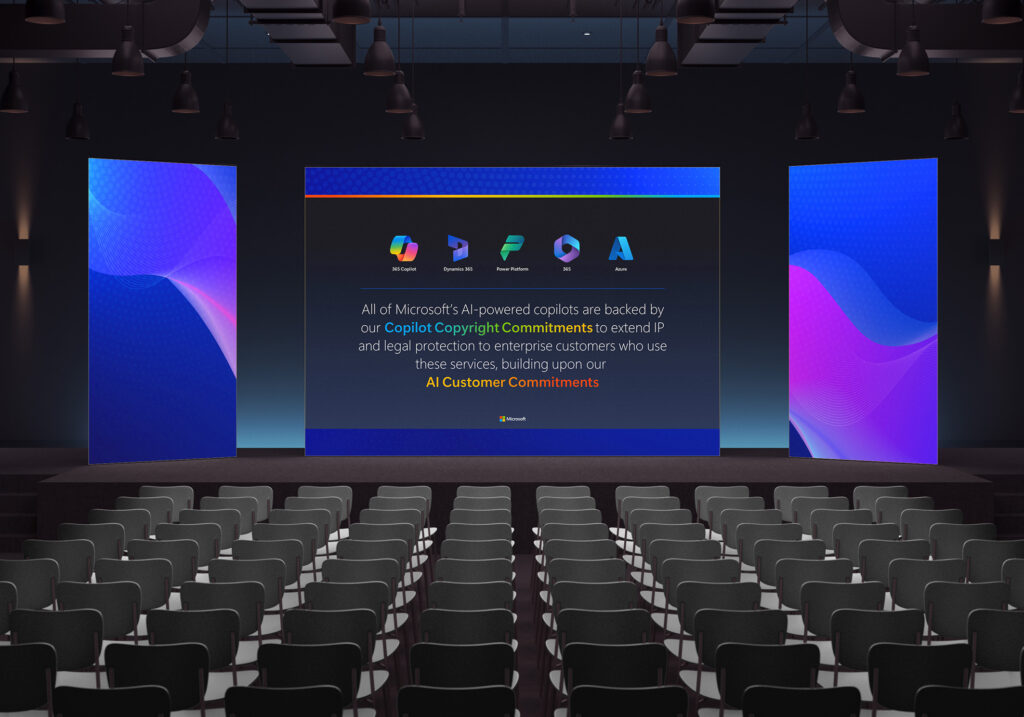
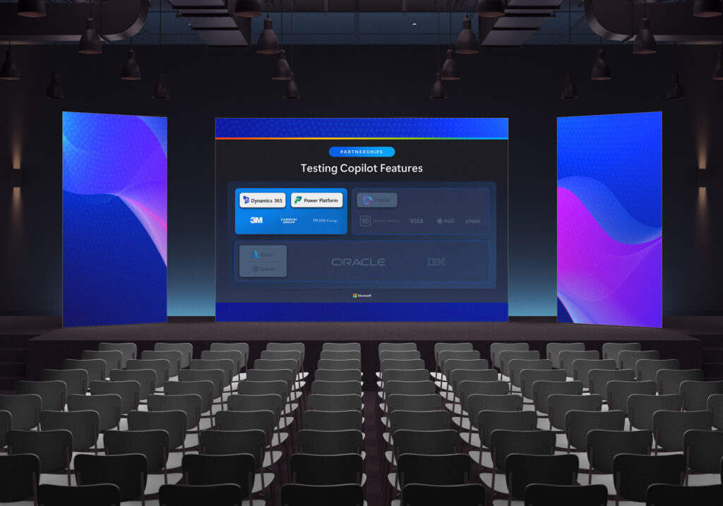
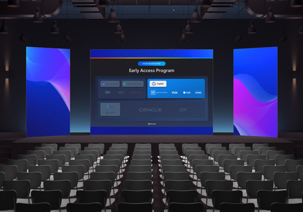
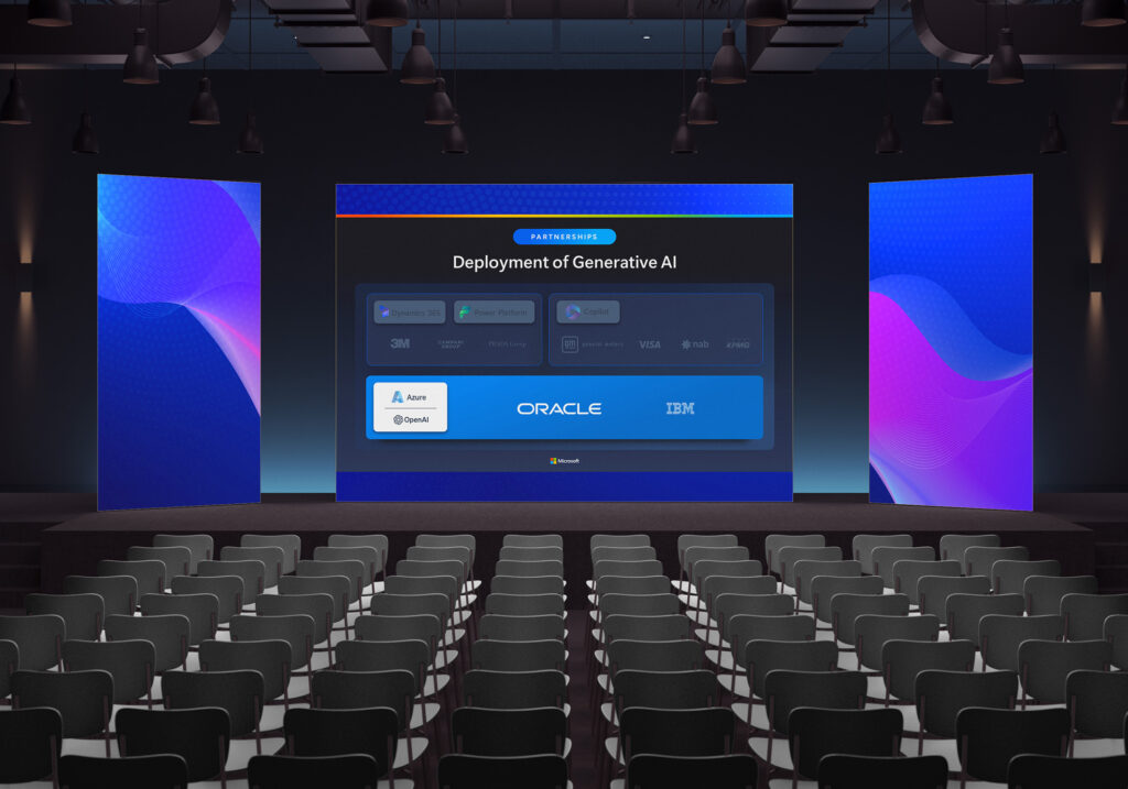
A design sample created for a Microsoft communications team supporting the CCO of Microsoft, on a new ecosystem of AI technologies.
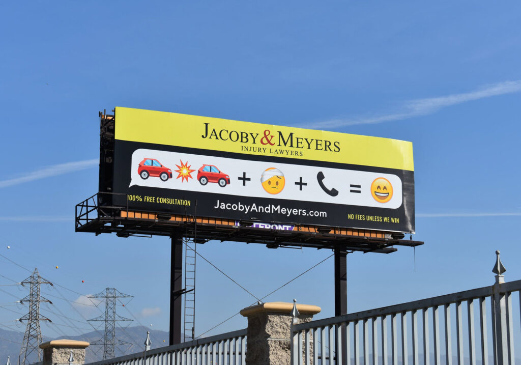
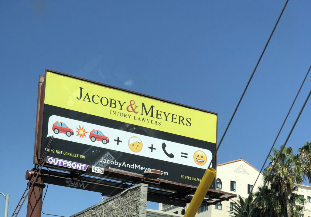
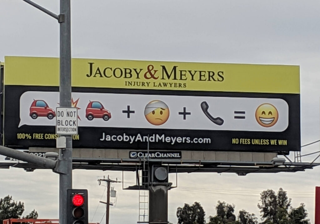
Attorney Billboards
Law Firm
info
20-40′ billboards for a high budget awareness campaign all over Los Angeles and Orange County. We kept the classic yellow and black “phonebook” colors while juxtaposing it with a text message bubble and crispy smartphone art.
One blog had this to say about it: “Aimed at millennials, it does a great job of reducing the fundamental logic of personal injury law to a form anyone can understand using emojis.“
The best part of this campaign was getting Slacks from my boss and coworkers whenever they saw one on the road, almost definitely while stuck in traffic.
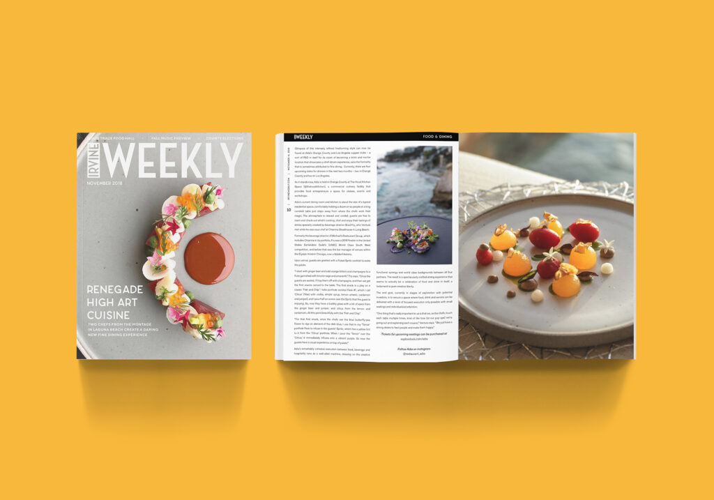
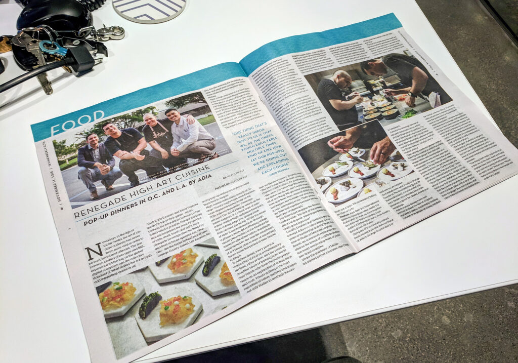
Restaurant Adia Article
Fine Dining concept
info
A 2,000 word original piece about a popup fine dining concept started by two chefs formerly of the Studio restaurant at the Montage Resort in Laguna Beach, widely considered one of the most artful and refined coastal dining destinations in Orange County. I sat in on two dinners, the first of which was their first ever. After doing the staff interview, I then staged a photoshoot at a coworker’s family member’s beachside home in Laguna Beach.
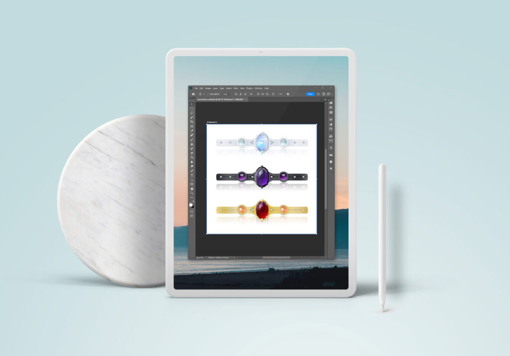
Cuff Design
Just for fun
info
Mockup of a fun design idea for a line of gemstone and diamond cuffs: Moonstone in white gold, amethyst in oxidized silver, garnet and sunstone in gold.
Thanks for visiting!
Please feel free to get in touch via email or set up a time for a call.
v10.21.2025
🌴 Custom built in Orange County 🌴
#viscom #marcoms #marketingdesign #marketingdesigner #corporatecommunications #executivecontent #presentationdesign #deckdesign #branddesign #powerpoint #googleslides #digitaldesign #contentdesign #strategydecks
© Karolyn Kay 2025
